
How Dan Bilzerian’s lifestyle shaped IGNITE packaging
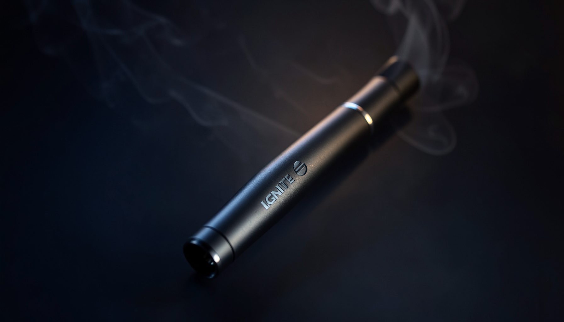
IGNITE packaging reflects a visual world associated with Dan Bilzerian: luxury, nightlife, confidence, travel, and unapologetic self-expression. The brand’s presentation is designed to feel less like ordinary convenience-store packaging and more like an accessory connected to a premium lifestyle.
That identity appears through bold colors, sharp typography, polished finishes, and flavor names that suggest energy and escape. Across the V15, V25, and V60 device lines, packaging helps customers distinguish products while reinforcing the recognizable IGNITE image.
For adult customers browsing the Ignite Vape Store, the design creates a clear connection between the device, its flavor profile, and the atmosphere the brand wants to project. The result is packaging that functions as both product protection and lifestyle branding.
From personal image to brand language
Dan Bilzerian’s public image is built around visual excess, confidence, and a taste for high-impact experiences. While packaging cannot reproduce an entire personality, it can translate selected elements of that image into color, layout, photography, and product presentation.
IGNITE draws on this approach by avoiding a quiet or understated appearance. The devices and boxes are intended to stand out, whether displayed in an online product gallery or held in a social setting. Strong contrast and assertive design choices communicate that the brand is comfortable being noticed.
This type of brand language is common in premium lifestyle markets. A watch, sports car, or designer fragrance often sells an atmosphere as much as a functional object. IGNITE packaging applies a similar principle to disposable vape products by making the visual identity part of the buying experience.
Bold design creates instant recognition
A successful package must communicate quickly. Customers often scan a product page or shelf display for only a few seconds, so the name, device line, flavor, and visual identity need to work together. IGNITE’s bold packaging helps create immediate recognition across its product range.
The use of strong color coding can also support flavor discovery. Fruit flavors may lean toward bright and energetic tones, while mint or iced options can use cooler shades that suggest freshness. These signals do not replace the flavor description, but they provide a fast visual cue before a customer reads the details.
The design also supports a consistent brand family. Even when V15, V25, and V60 models differ in capacity or format, shared visual elements make them feel connected. Customers can identify the IGNITE look while comparing features and flavor options.
Luxury cues meet portable convenience
Bilzerian’s lifestyle branding often emphasizes premium surroundings, private travel, nightlife, and exclusivity. IGNITE packaging adapts those associations without turning a disposable device into a formal luxury good. Glossy surfaces, clean alignment, metallic accents, and saturated colors can make a compact product feel more polished.
That contrast is important. Disposable vapes are designed for portability and convenience, yet the packaging gives them a more elevated presence. A small device can be carried easily while still presenting itself as a considered lifestyle product rather than an anonymous utility item.
The visual strategy also supports online retail. When shoppers browse the Ignite Vape Store, package imagery has to convey quality through a screen. Clear product photography, recognizable branding, and a refined layout help customers compare devices before adding an item to the cart.
| Packaging element | Lifestyle association | Customer-facing function |
|---|---|---|
| Saturated colors | Energy, nightlife, and confidence | Helps products stand out and separates flavor families |
| Metallic or glossy details | Premium quality and exclusivity | Adds visual polish to the device and box |
| Strong typography | Directness and self-assurance | Makes the brand and model easy to identify |
| Flavor-led artwork | Travel, freshness, and indulgence | Gives shoppers a quick sense of the flavor profile |
| Consistent product styling | A recognizable personal brand | Connects V15, V25, and V60 products |
Flavor names extend the experience
Packaging inspired by a high-energy lifestyle needs more than a logo. Flavor presentation gives each product its own mood. Fruit, mint, and iced varieties can suggest different occasions, from a bright daytime profile to a cool and refreshing finish.
This is where visual identity and sensory expectation meet. A vivid package may prepare customers for a bold fruit blend, while icy blue or crisp green details can imply a cooling sensation. The design does not determine the taste, but it shapes the first impression before the device is used.
IGNITE’s flavor range also gives customers room to choose according to preference and personality. Some may be drawn to sweet fruit combinations, while others prefer the clean character of mint or the sharper feel of an iced option. Packaging helps make those distinctions easy to navigate.
The device becomes a lifestyle accessory
A disposable vape is often purchased for practical reasons, including portability and ease of use. However, branding can influence how the product is perceived in everyday life. IGNITE’s packaging and device styling position the product as something that can fit into a personal aesthetic.
That approach reflects the broader influence of fashion and entertainment branding. Products associated with public figures frequently borrow visual cues from their clothing, cars, travel, or social environments. In IGNITE’s case, the connection is expressed through a confident, high-contrast appearance rather than a minimalist or clinical design.
The device’s compact form also reinforces this positioning. It can be stored in a pocket or bag, carried during travel where permitted, and selected from a range of colors and flavors. The packaging makes that convenience feel intentional and brand-led.
Why consistency matters across IGNITE lines
A lifestyle brand needs continuity. If each product looked unrelated, customers would have difficulty recognizing the range or understanding how individual devices fit together. Consistent logos, typography, color discipline, and photographic treatment create a unified identity.
The V15, V25, and V60 lines can therefore appeal to different preferences while remaining part of the same family. Customers may compare specifications, puff counts, dimensions, or flavor availability, but the brand experience remains familiar throughout the catalog.
This consistency also benefits customer support and online ordering. Clear product names and recognizable packaging reduce confusion when shoppers are reviewing several devices. A well-organized presentation makes it easier to select a model, check available flavors, and complete a purchase through the Ignite Vape Store.
Choosing an IGNITE product with care
Packaging can make a product memorable, but practical details should guide the final choice. Adult customers should review the device information, flavor description, nicotine strength, and local purchasing rules before ordering.
Useful points to consider include:
- Select a device line that matches your preferred size, capacity, and usage pattern.
- Read the flavor description carefully, especially when comparing fruit, mint, and iced profiles.
- Check nicotine details and purchase only if you meet the legal age requirement in your location.
- Review shipping information and product availability before adding an item to your cart.
- Store vape products responsibly and follow all manufacturer and local safety guidance.
The lifestyle influence behind IGNITE packaging works because it connects appearance with product navigation. Customers receive a clear visual signal, then can use the online catalog to verify the information that matters most.
IGNITE’s approach shows how a founder’s public image can become a complete branding system. Confidence appears in the typography, luxury in the finish, nightlife in the color palette, and individuality in the flavor selection. Together, these elements give the V15, V25, and V60 lines a distinctive presence.
Browse the Ignite Vape Store to explore available IGNITE devices and flavors, review product details, and choose an option that fits your preferences and applicable local requirements.