
What the IGNITE brand logo represents
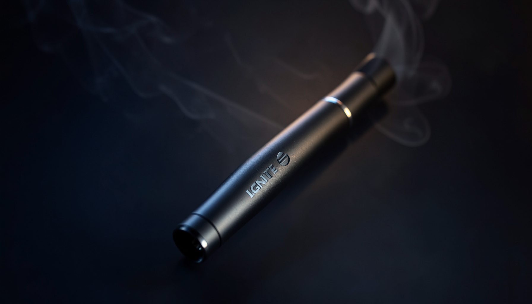
The IGNITE brand logo serves as the central visual identifier for a range of disposable vape devices built around energy, individuality and lifestyle appeal. Its bold name treatment gives shoppers an immediate point of recognition, while the broader identity connects ignition, movement and personal confidence. On packaging, hardware and digital product pages, the mark helps turn a functional device into a recognizable consumer product.
The logo also supports IGNITE’s positioning as a premium lifestyle brand founded by Dan Bilzerian. Rather than relying on a detailed crest or traditional luxury emblem, the identity uses a direct wordmark and a consistent visual language that can remain legible across small devices, colourful cartons and online listings. The result is designed to look confident, contemporary and easy to identify in a crowded retail setting.
| Design cue | Immediate impression | Brand message |
|---|---|---|
| IGNITE wordmark | Strong and memorable | Confidence and recognition |
| Ignition-inspired imagery | Active and energetic | Spark, momentum and intensity |
| Bold capital lettering | Direct and modern | A clear lifestyle identity |
| Repeated hardware branding | Consistent and authentic | Quality and product traceability |
| Streamlined presentation | Premium but accessible | Curated variety without ornamentation |
A wordmark built for instant recognition
The clearest part of the IGNITE identity is its uppercase wordmark. Large capital letters create visual authority and make the brand readable from a distance, which is useful when the logo appears on a compact disposable device or among several brightly coloured packages. The name itself is short, sharp and forceful, giving it the qualities associated with an ignition sequence: something immediate, energetic and difficult to overlook.
Consistency matters as much as the initial design. Repeating the same wordmark across V15, V25 and V60 packaging helps shoppers understand that the devices belong to one family even when their capacities, colours and flavour profiles differ. This visual continuity supports brand recognition and gives the catalogue a coherent structure, rather than presenting each model as an unrelated product.
Fire, energy and the meaning of ignition
IGNITE’s name naturally evokes fire, heat and a sudden burst of energy. That meaning extends into the brand’s visual world through ignition-inspired cues and the use of vivid contrast in product presentation. Rather than describing a literal flame alone, these elements communicate a sense of activation: the moment when a device is switched on and the user begins an experience.
The symbolism also fits the brand’s lifestyle positioning. Ignition can suggest confidence, momentum and personal drive, qualities that align with the energetic identity associated with Dan Bilzerian’s venture. This interpretation is important because the logo does not need to illustrate every product attribute. It establishes an emotional frame, while the device names, flavours and packaging communicate what the customer can actually choose.
From logo to product experience
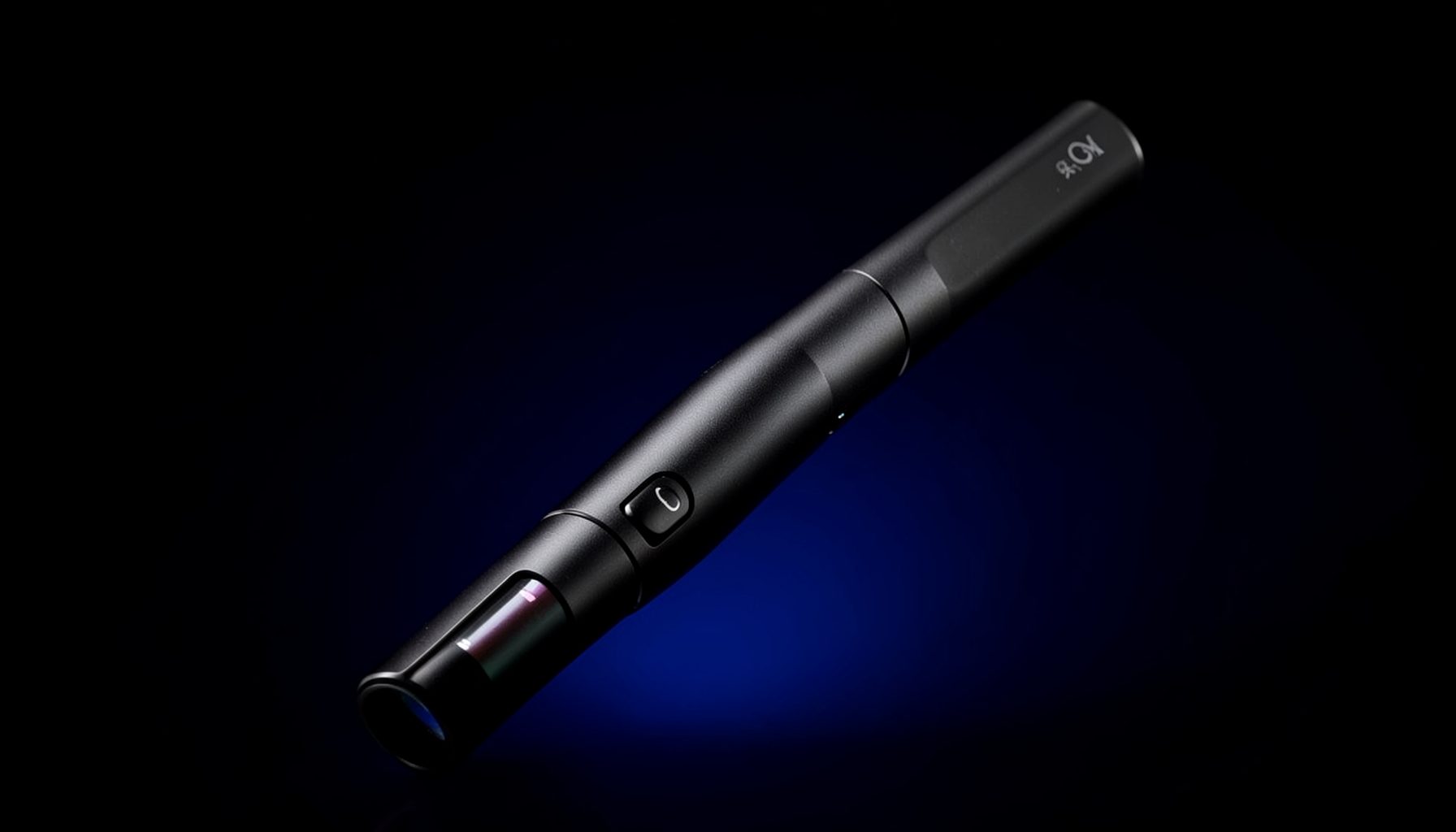
The strongest brands make their identity visible at every point where a customer interacts with the product. On IGNITE devices, the branding acts as a signature that connects the physical item to its packaging and online listing. It helps distinguish an official product from an unbranded or loosely presented alternative, which is especially relevant when shoppers compare different disposable models by appearance as well as specifications.
The catalogue reflects that identity across several hardware lines. The V15, V25 and V60 devices provide different formats for users seeking variety in capacity and style, while fruit, mint and iced flavours offer a broader range of taste experiences. Customers can explore the IGNITE range to view the available devices and familiarise themselves with the branding used across the collection.
Flavour and colour do much of the work at the point of selection, but the logo remains the unifying element. A shared mark gives each option the same provenance, whether the packaging is fruit-inspired, cool mint-toned or associated with an iced profile. This allows the range to feel varied without losing the strong visual identity expected from a premium lifestyle label.
What the logo means for Australian shoppers
Australian regulations add an important layer to how the IGNITE identity is encountered locally. Under federal rules introduced on 1 July 2024, nicotine vapes are supplied through licensed pharmacies and generally require a valid prescription. Standard settings also restrict permitted flavours, prohibit single-use vaping products and impose rules around nicotine strength and pack sizes. Fruit-flavoured and iced disposable devices featured in an international catalogue may therefore have no lawful retail route for Australian consumers.
This change has transformed the local market in cities such as Sydney and Melbourne. Vape products that were once widely displayed in convenience stores and service stations now sit within a tightly regulated pharmacy system. The prominent presence of the IGNITE logo can still communicate brand identity to international customers, but Australian buyers must separate the visual appeal of a product from whether it may legally be purchased and used in the country. People under 18 are also generally barred from accessing nicotine vaping products.
Customs and border controls form another practical consideration. An overseas online order should not be treated as a convenient workaround for the pharmacy system, and travellers cannot assume that a retail pack can legally be carried into Australia. Australian Customs and the Therapeutic Goods Administration can act on non-compliant imports, while local health authorities advise adults to use approved supply channels. The store’s catalogue, cart and customer-support process may assist with product information, but they do not override federal law.
Premium lifestyle and brand trust
Premium positioning does not always depend on elaborate symbols. For IGNITE, the logo’s disciplined typography and consistent placement create a sense of refinement through clarity. The result feels deliberate and controlled, even when the surrounding product colours are loud or playful. That balance allows the brand to appear fashion-conscious and contemporary rather than purely technical.
The connection to Dan Bilzerian also gives the identity a recognisable public figure as part of its story. His association with ambition, fitness and entrepreneurial culture supports the themes of drive and activation already present in the name. The logo thus operates in two directions: it identifies a specific family of disposable vapes, and it places those products within a wider lifestyle narrative built around confidence and momentum.
Trust is another function of the mark. A clear logo on the device and packaging provides a visual cue of origin and consistency, helping customers associate the physical product with the official range. In an industry where closely similar products can appear online, that traceability is valuable. It also reinforces the perception that the brand has a defined design system rather than treating the device purely as an interchangeable disposable accessory.
A durable symbol of activation
The IGNITE logo is effective because it communicates a small number of ideas very quickly. The name conveys ignition; the capital lettering creates authority; and repeated use across products builds familiarity. Its meaning comes from this combination of direct symbolism, visual consistency and lifestyle context, not from complexity.
As IGNITE continues to present itself as a premium brand to an international audience, the mark will remain central to how its products are recognised. In Australia, its commercial relevance must be understood alongside the country’s strict pharmacy, prescription, customs and public-health framework. Even with those local differences, the logo’s core message stays consistent: it is a compact visual signal of energy, confidence and a distinctly recognisable lifestyle identity.