
What the Packaging Tells You About IGNITE’s Premium Status
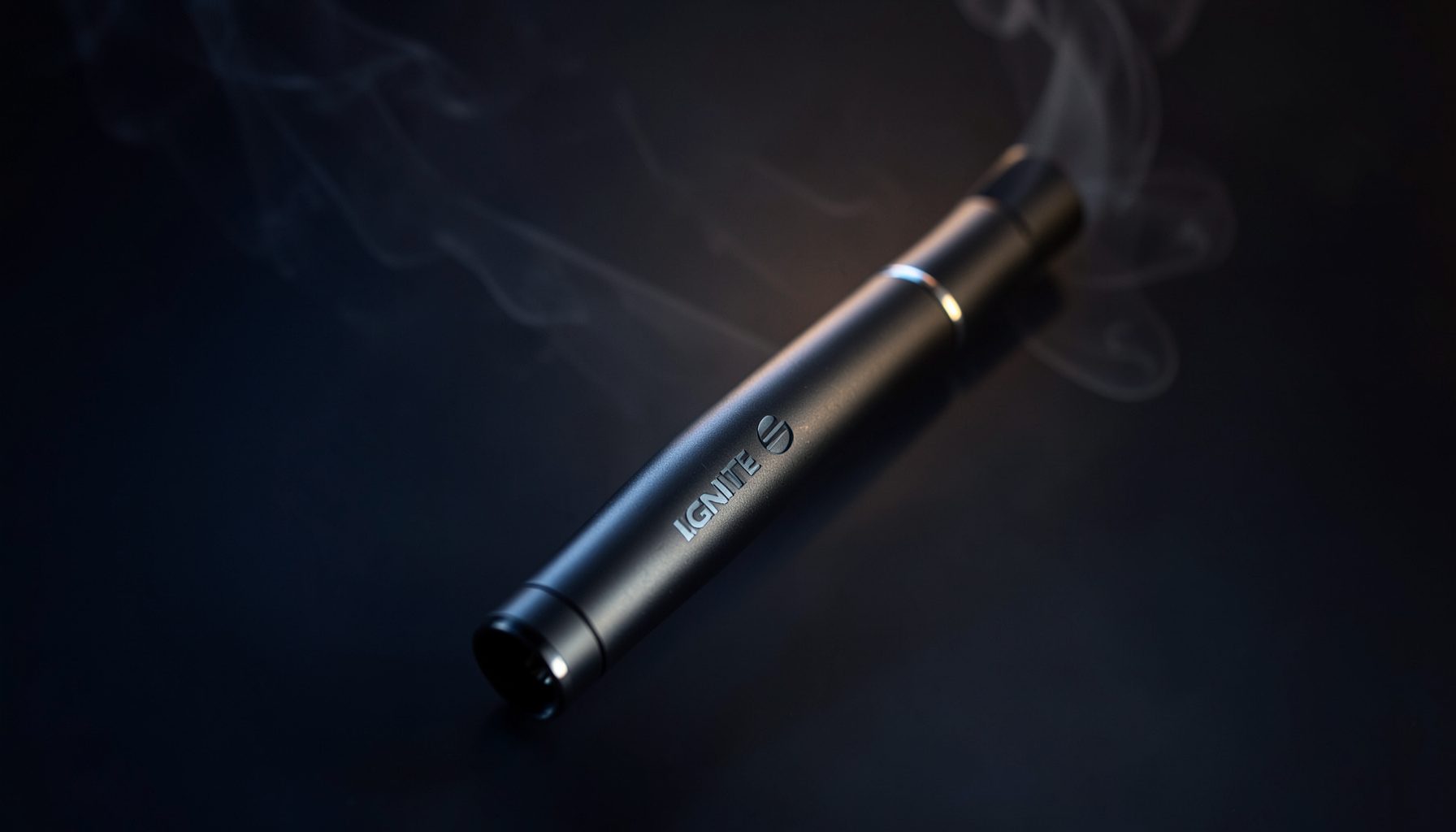
Packaging is often the first physical expression of a vape brand. Before a customer notices the flavour profile, device shape or vapour performance, they see the box, colours, typography and finish. For a brand such as IGNITE, those details help communicate whether the product is positioned as a basic disposable or as part of a more polished lifestyle range.
IGNITE’s V15, V25 and V60 lines use packaging to create a recognisable family appearance while leaving room for different fruit, mint and iced flavour combinations. That balance matters: consistent design suggests brand discipline, while clear flavour distinctions make browsing easier.
A premium appearance, however, should be treated as a visual signal rather than proof of quality, authenticity or legal sale. Australian customers need to consider labelling, ingredient information, nicotine disclosure and the rules applying in their state or territory alongside the box’s appearance.
Brand Signals Beyond The Logo
Premium branding usually depends on restraint. A crowded package with too many claims can feel promotional, while a controlled colour palette, strong spacing and a clear logo can make the product appear more deliberate. IGNITE’s lifestyle-led identity uses bold visual cues that are easy to recognise across different device families and flavour categories.
The design also helps the range feel connected. A customer comparing a V15 with a V25 or V60 can look for recurring brand elements while using flavour names and colour accents to distinguish individual products. This is useful in an online catalogue, where the package image often replaces the experience of handling a product in a shop.
The brand story associated with Dan Bilzerian adds another layer to the presentation. It positions IGNITE within a confident, high-energy lifestyle rather than presenting the device as a purely functional nicotine product. That approach may appeal to adult consumers who value identity and visual consistency, though lifestyle messaging should never distract from responsible use or regulatory information.
Materials, Typography And Everyday Handling
A box can suggest quality through its physical construction. Sturdy cardboard, accurate folds, clean printing and a finish that resists scuffing can make a product feel more carefully made. These details are especially noticeable when an order arrives by post in Australia, where packaging may pass through automated sorting, delivery vans and periods of heat before reaching Sydney, Melbourne or Brisbane.
Typography is equally important. Flavour names should be legible without magnification, and key information should not disappear into decorative graphics. A premium pack makes it easy to identify the device line, flavour, nicotine strength where applicable, batch details and manufacturer or importer information. The visual hierarchy should guide the eye rather than force the customer to search.
Practicality is part of perceived value. A box that opens cleanly, protects the device and includes suitable safety information feels more credible than one that relies entirely on glossy artwork. For Australian buyers, clear storage guidance is relevant during hot weather, particularly in Queensland and Western Australia, where products may be exposed to high temperatures during transport or at home.
How Different Device Lines Communicate Value
The relationship between packaging and product range can be seen in the way each line creates a different expectation. A smaller-format product may be associated with portability, while a larger model can appear designed for longer use or a more substantial device experience. Packaging should explain those distinctions without making unsupported performance promises.
Flavour architecture also contributes to the premium impression. Fruit, mint and iced profiles can be arranged in a coherent naming system, allowing customers to understand the range quickly. Someone looking for a calmer evening option may find useful context in this evening flavour guide, while another customer may prefer a sharper mint or cooling profile.
| Packaging feature | What it can communicate | What to verify separately |
|---|---|---|
| Consistent IGNITE branding | A unified product family | Genuine source and authorised distribution |
| Distinct V15, V25 or V60 presentation | Clear range segmentation | Actual specifications and device contents |
| Colour-coded flavour design | Easier flavour recognition | Ingredients, nicotine strength and warnings |
| Quality cardboard and printing | Careful presentation and protection | Storage, seal integrity and batch information |
| Lifestyle imagery or messaging | A strong brand personality | Whether claims are appropriate and compliant |
| Scannable codes or detailed labels | Traceability and customer confidence | Whether the code works and leads to reliable information |
This distinction is important because premium packaging can be imitated. A convincing box may still contain an unauthorised, altered or counterfeit product. Packaging earns trust when its visual quality is supported by traceable information and a dependable supply chain.
Reading Premium Packaging In Australia
Australia has a stricter vaping environment than many overseas markets. Nicotine vaping products are regulated as therapeutic goods, and access generally involves a prescription pathway, pharmacy supply and requirements set by the Therapeutic Goods Administration. State and territory rules also affect possession, supply, advertising and use, so a product marketed online is not automatically lawful for every customer.
Packaging should therefore be examined for more than colour and finish. Look for clear nicotine information, warnings, ingredient details, batch or lot references, an expiry date where relevant, storage instructions and the identity of the responsible supplier. Missing, poorly printed or inconsistent information is a warning sign, regardless of how premium the graphics appear.
Australian customers should also be aware of import and border controls. Rules have changed over time, and requirements can differ for personal use, prescription supply and commercial distribution. An online listing that ships to a major city does not by itself establish compliance. Checking current TGA guidance and local requirements is more reliable than relying on promotional language.
Checks That Support A More Informed Choice
A polished package can make comparison easier when it is paired with practical verification. These checks help separate genuine product presentation from surface-level branding:
- Confirm that the device line and flavour on the box match the online product description.
- Check the seal, print quality, batch details and any traceability code before opening the package.
- Read nicotine strength, ingredients, warnings and storage instructions rather than judging quality by appearance.
- Review current TGA requirements and the vaping rules applying in your state or territory.
- Treat claims about puff counts, duration or performance as specifications to verify, not automatic guarantees.
- Keep devices away from children, pets, heat and direct sunlight, especially during Australian summer conditions.
Premium status is strongest when design, construction, information and accountability work together. IGNITE’s packaging creates a recognisable visual world around its disposable device lines, and the use of coordinated colours and flavour cues can make the catalogue easier to navigate. Those elements explain the brand’s premium positioning, but they are only one part of a responsible assessment.
For Australian customers, the most convincing package is one that looks refined while remaining clear about what is inside, who supplied it and how it should be handled. Good design attracts attention; accurate information and verifiable sourcing are what give that first impression lasting credibility.